
This feature is in and subject to change. To share feedback and/or issues, contact Support.
On a , you must be an
admin user to access this area of the DB Console. Refer to .Required privileges
To view the Advanced Debug page and work with the Key Visualizer, the user must be a member of theadmin role or must have the VIEWDEBUG defined.
Enable the Key Visualizer
To use the Key Visualizer, thekeyvisualizer.enabled must be set to true, using the statement:
Key Visualizer features
Once you have enabled the Key Visualizer, CockroachDB will begin monitoring keyspace usage across your cluster. Data is only collected while the Key Visualizer is enabled; you cannot visualize data from a time period before you enabled it. When navigating to the Key Visualizer page in the DB Console, after a brief loading time, CockroachDB will present the collected data in a visualization designed to help you see data traffic trends at a glance.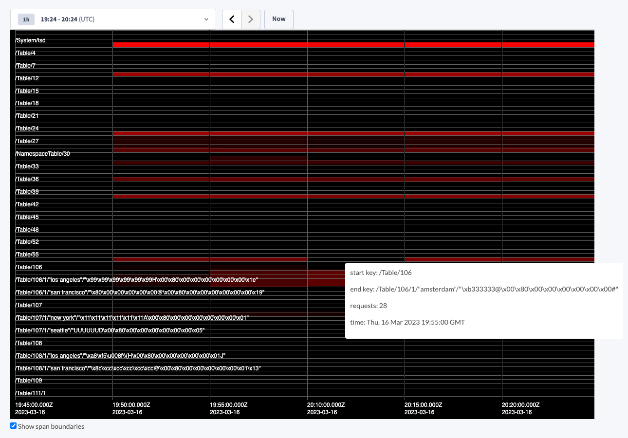
- The entire is represented on the Y-axis, and is broken up into buckets representing whole ranges of the keyspace, or aggregated ranges if the number of ranges in the keyspace exceeds the configured number of buckets.
- Time is represented on the X-axis, with its granularity (i.e., frequency of data collection) being controlled by the configured sample period.
- Keyspace activity is visualized on a color scale from black to red, representing “cold” and “hot” respectively. Thus, a range shown in bright red indicates a , while a range shown in black indicates a range with little to no active reads or writes. Hotspots are identified relative to other ranges; for example, a range that receives one write per minute could be considered a hotspot if the rest of the ranges on the cluster aren’t receiving any. A range shown in red is therefore not necessarily itself indicative of a problem, but it may help to narrow a problem down to a specific range or group of ranges when troubleshooting cluster performance.
- Boundaries between buckets and time samples appear as grey lines. You can disable the drawing of these lines by deselecting the Show span boundaries checkbox below the Key Visualizer.
- You can zoom in to focus on a particular range or sample period, or zoom out to see the entire keyspace at once, up to the maximum historical data retention period of seven days.
- Hovering over a range in the Key Visualizer presents a tooltip with the start key, end key, number of requests, and timestamp of the recorded sample.
Key Visualizer customization
Beyond thekeyvisualizer.enabled , which must be enabled in order to use the Key Visualizer, there are two additional cluster settings that may be adjusted to control its behavior:
Together, these cluster settings control the sampling resolution, or granularity, of the key data that the Key Visualizer collects and presents.
If your cluster has a large number of ranges, and the storage headroom to store the increased historical data, you might increase
keyvisualizer.max_buckets to get more granularity in the visualizer, making pinpointing a specific problematic key range easier. Similarly, you might lower keyvisualizer.sample_interval to achieve more frequent samples, identifying changes between recorded samples more closely to when they actually occurred.
If your cluster has limited storage space available, you might decrease keyvisualizer.max_buckets and raise keyvisualizer.sample_interval to effectively store less collected data, at the cost of the Key Visualizer presenting a broader, less granular view of the keyspace.
If you adjust either of these values, new keyspace activity data collected by the Key Visualizer will reflect the new values, but previously-collected activity data will remain unchanged.
Troubleshooting performance with the Key Visualizer
When troubleshooting a performance issue with your cluster, use the Key Visualizer to identify which range or ranges in your keyspace to focus on. If needed, consider adjusting the Key Visualizer’s granularity of data collection to more closely focus on a problematic range of keys if necessary, especially if the keyspace is very large and you have the storage headroom in your cluster to store the additional sample data. The Key Visualizer was designed to make potentially problematic ranges stand out visually; as such, bright red spot are generally good places to begin a performance investigation. For example, consider the following cases:Identifying hotspots
The following image shows the Key Visualizer highlighting a series of : ranges with much higher-than-average write rates as compared to the rest of the cluster.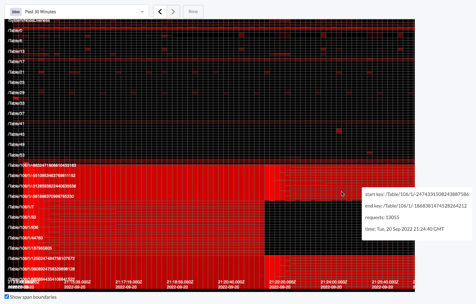
Identifying full table scans
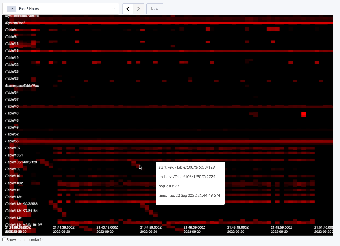
The following image shows the Key Visualizer highlighting a , where the lack of an appropriate index causes the query planner to need to scan the entire table to find the requested records in a query. This can be seen most clearly by the cascading series of bright red ranges that proceed in diagonal fashion to each other, such as the series of three shown at the mouse cursor. This cascade represents the sequential scan of contiguous ranges in the keyspace as the query planner attempts to locate requested data without an index.