
The Distributed dashboard lets you monitor important distribution layer health and performance metrics. To view this dashboard, and click Metrics on the left-hand navigation, and then select Dashboard > Distributed.

Dashboard navigation

Use the Graph menu to display metrics for your entire cluster or for a specific node. To the right of the Graph and Dashboard menus, a time interval selector allows you to filter the view for a predefined or custom time interval. Use the navigation buttons to move to the previous, next, or current time interval. When you select a time interval, the same interval is selected in the pages. However, if you select 10 or 30 minutes, the interval defaults to 1 hour in SQL Activity pages. Hovering your mouse pointer over the graph title will display a tooltip with a description and the used to create the graph. When hovering on graphs, crosshair lines will appear at your mouse pointer. The series’ values corresponding to the given time in the cross hairs are displayed in the legend under the graph. Hovering the mouse pointer on a given series displays the corresponding value near the mouse pointer and highlights the series line (graying out other series lines). Click anywhere within the graph to freeze the values in place. Click anywhere within the graph again to cause the values to change with your mouse movements once more. In the legend, click on an individual series to isolate it on the graph. The other series will be hidden, while the hover will still work. Click the individual series again to make the other series visible. If there are many series, a scrollbar may appear on the right of the legend. This is to limit the size of the legend so that it does not get endlessly large, particularly on clusters with many nodes.
All timestamps in the DB Console are shown in Coordinated Universal Time (UTC).
The Distributed dashboard displays the following time series graphs:

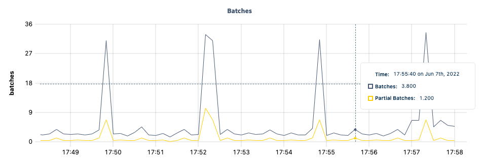
Batches

DB Console batches graph The Batches graph displays various details about traffic in the . Hovering over the graph displays values for the following metrics:
MetricDescription
BatchesThe number of BatchRequests made, as tracked by the distsender.batches metric.
Partial BatchesThe number of partial BatchRequests made, as tracked by the distsender.batches.partial metric.

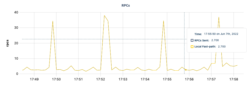
RPCs

DB Console RPCs graph The RPCs graph displays various details about traffic in the . Hovering over the graph displays values for the following metrics:
MetricDescription
RPCs SentThe number of RPC calls made, as tracked by the distsender.rpc.sent metric.
Local Fast-pathThe number of local fast-path RPC calls made, as tracked by the distsender.rpc.sent.local metric.

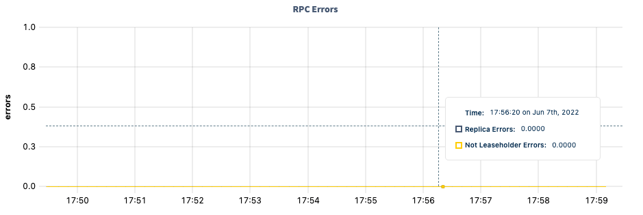
RPC Errors

DB Console RPC errors graph The RPC Errors graph displays various details about errors encountered in the . Hovering over the graph displays values for the following metrics:
MetricDescription
Replica ErrorsThe number of RPCs sent due to per-replica errors, as tracked by the distsender.rpc.sent.nextreplicaerror metric.
Not Leaseholder ErrorsThe number of NotLeaseHolderErrors logged, as tracked by the distsender.errors.notleaseholder metric.

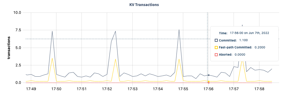
KV Transactions

DB Console KV transactions graph The KV Transactions graph displays various details about transactions in the . Hovering over the graph displays values for the following metrics:
MetricDescription
CommittedThe number of committed KV transactions (including fast-path), as tracked by the txn.commits metric.
Fast-path CommittedThe number of committed one-phase KV transactions, as tracked by the txn.commits1PC metric.
AbortedThe number of aborted KV transactions, as tracked by the txn.aborts metric.

KV Transaction Durations: 99th percentile
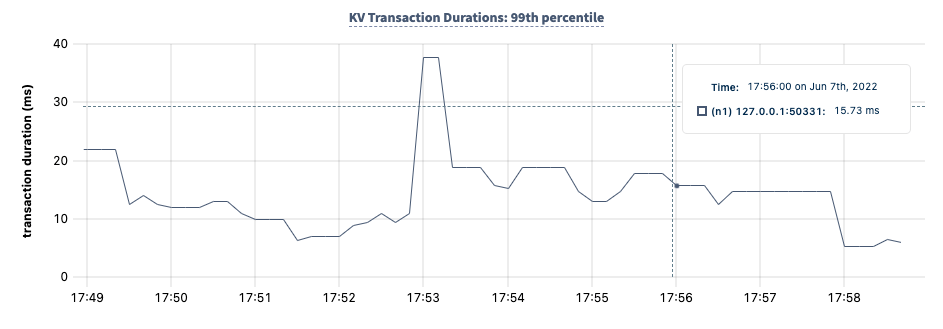
DB Console KV transaction durations: 99th percentile graph The KV Transaction Durations: 99th percentile graph displays the 99th percentile of transaction durations over a one-minute period. Hovering over the graph displays values for the following metrics:
MetricDescription
The 99th percentile of transaction durations observed over a one-minute period for that node, as calculated from the txn.durations metric.

KV Transaction Durations: 90th percentile
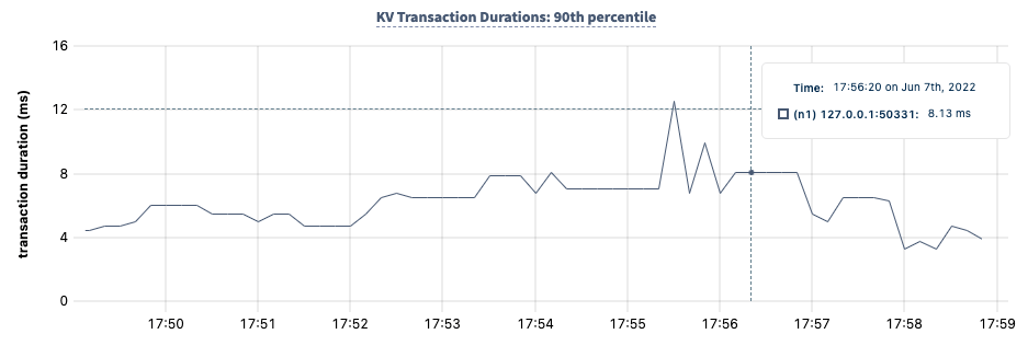
DB Console KV transaction durations: 90th percentile graph The KV Transaction Durations: 90th percentile graph displays the 90th percentile of transaction durations over a one-minute period. Hovering over the graph displays values for the following metrics:
MetricDescription
The 90th percentile of transaction durations observed over a one-minute period for that node, as calculated from the txn.durations metric.

Node Heartbeat Latency: 99th percentile
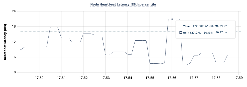
DB Console node heartbeat latency: 99th percentile graph The Node Heartbeat Latency: 99th percentile graph displays the 99th percentile of time elapsed between node heartbeats on the cluster over a one-minute period. Hovering over the graph displays values for the following metrics:
MetricDescription
The 99th percentile of time elapsed between heartbeats on the cluster over a one-minute period for that node, as calculated from the liveness.heartbeatlatency metric.
For the purposes of and determining the of a , node health is no longer determined by heartbeating a single “liveness range”; instead it is determined using . However, node heartbeats of a single range are still used to determine:
  • Whether a node is still a member of a cluster (this is used by ).
  • Whether a node is dead (in which case ).
  • How to avoid placing replicas on dead, decommissioning or unhealthy nodes, and to make decisions about lease transfers.

Node Heartbeat Latency: 90th percentile
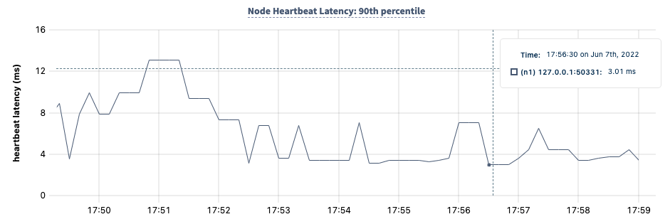
DB Console node heartbeat latency: 90th percentile graph The Node Heartbeat Latency: 90th percentile graph displays the 90th percentile of time elapsed between node heartbeats on the cluster over a one-minute period. Hovering over the graph displays values for the following metrics:
MetricDescription
The 90th percentile of time elapsed between node heartbeats on the cluster over a one-minute period for that node, as calculated from the liveness.heartbeatlatency metric.
For the purposes of and determining the of a , node health is no longer determined by heartbeating a single “liveness range”; instead it is determined using . However, node heartbeats of a single range are still used to determine:
  • Whether a node is still a member of a cluster (this is used by ).
  • Whether a node is dead (in which case ).
  • How to avoid placing replicas on dead, decommissioning or unhealthy nodes, and to make decisions about lease transfers.

Summary and events

Summary panel

A Summary panel of key metrics is displayed to the right of the timeseries graphs.
MetricDescription
Total NodesThe total number of nodes in the cluster. are not included in this count.
Capacity UsedThe storage capacity used as a percentage of allocated across all nodes.
Unavailable RangesThe number of unavailable ranges in the cluster. A non-zero number indicates an unstable cluster.
Queries per secondThe total number of SELECT, UPDATE, INSERT, and DELETE queries executed per second across the cluster.
P99 LatencyThe 99th percentile of service latency.
If you are testing your deployment locally with multiple CockroachDB nodes running on a single machine (this is ), you must explicitly per node in order to display the correct capacity. Otherwise, the machine’s actual disk capacity will be counted as a separate store for each node, thus inflating the computed capacity.

Events panel

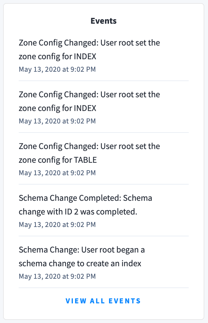
Underneath the Summary panel, the Events panel lists the 5 most recent events logged for all nodes across the cluster. To list all events, click View all events. DB Console Events The following types of events are listed:
  • Database created
  • Database dropped
  • Table created
  • Table dropped
  • Table altered
  • Index created
  • Index dropped
  • View created
  • View dropped
  • Schema change reversed
  • Schema change finished
  • Node joined
  • Node decommissioned
  • Node restarted
  • Cluster setting changed

See also